HOME
PAINTINGS
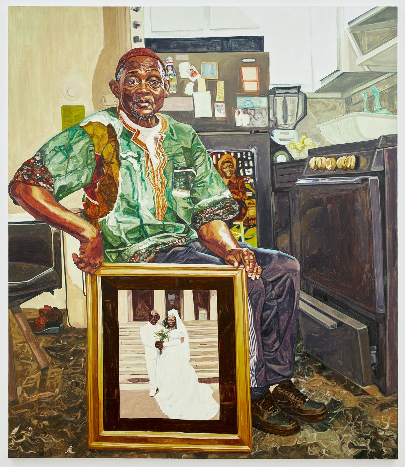
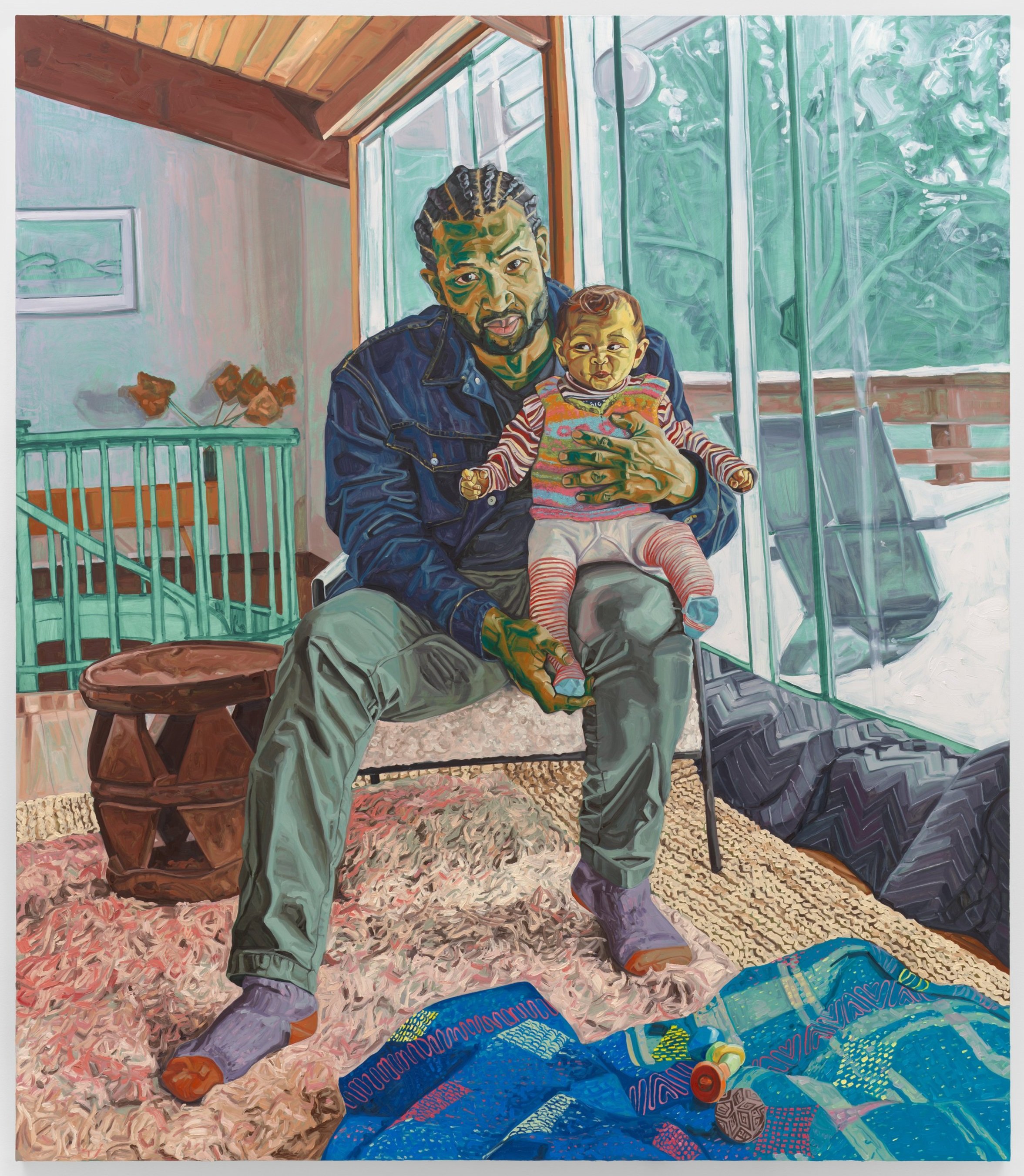
2024
2023
2022
2021
2020-2019
2018-2017
2016-2015
2014-2013
SOLO EXHIBITIONS
Recent Landscapes
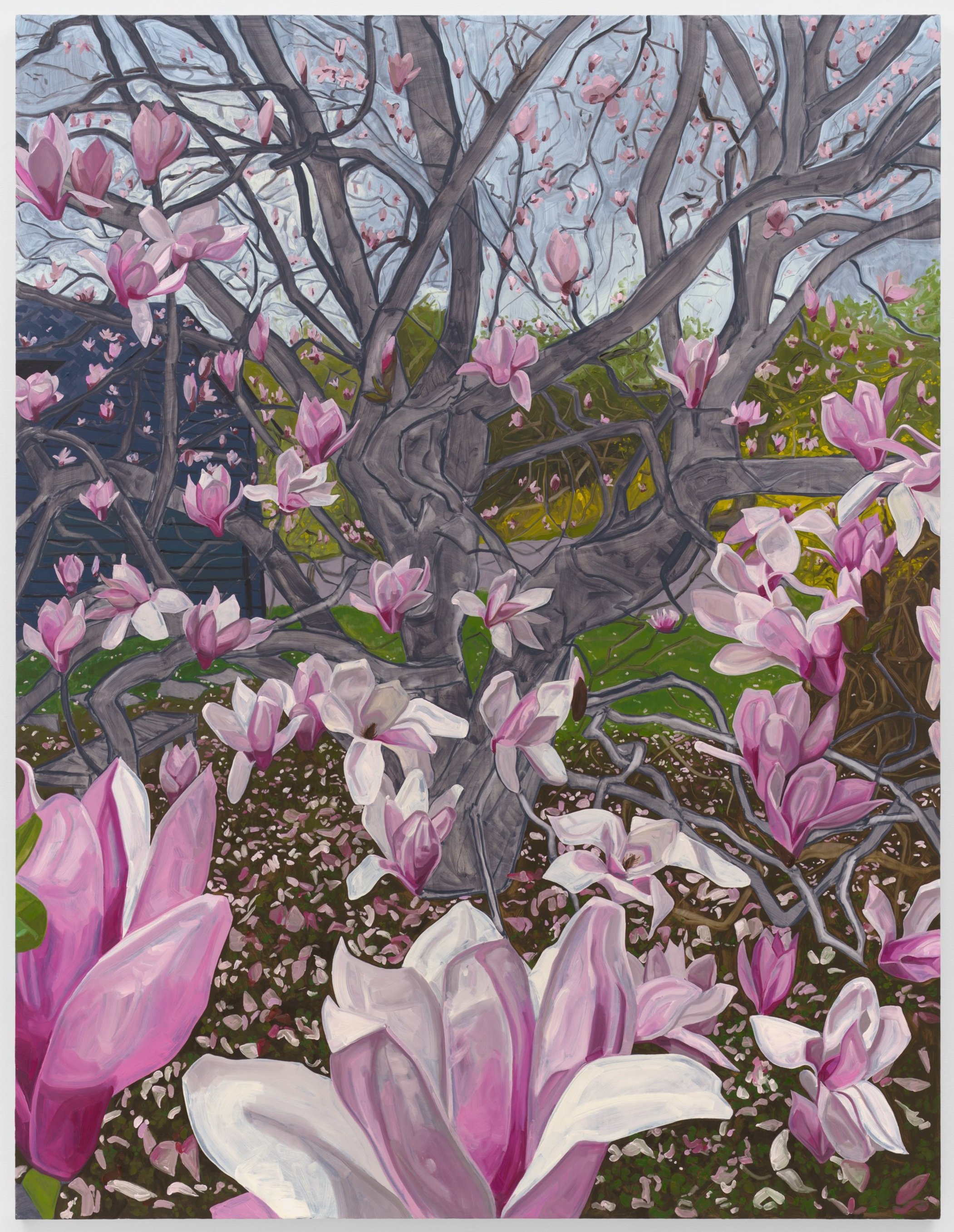
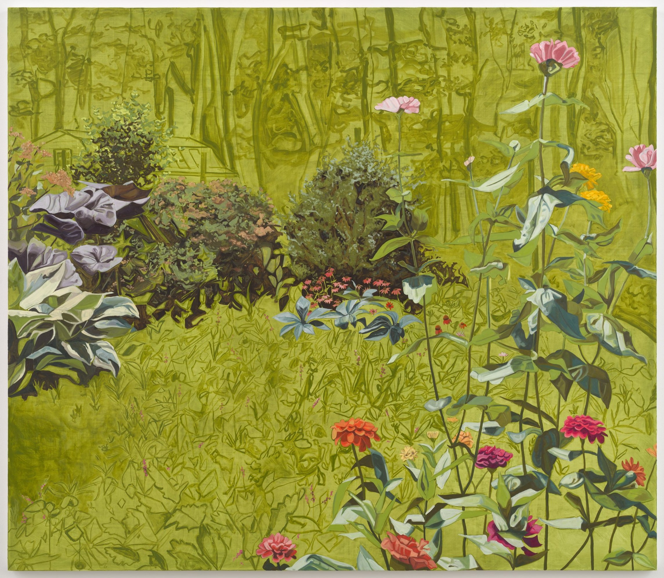
In bloom
There is a Season
Within Reach
The Baayfalls
The Practice of Freedom
Returning the Gaze
Nights in Harlem
Brothers
Visible Man
ON VIEW
Exhibitions
Public Collections
PUBLIC ART
EVENTS
PUBLICATIONS
CV
ABOUT
CONTACT
Menu
HOME
PAINTINGS
2024
2023
2022
2021
2020-2019
2018-2017
2016-2015
2014-2013
SOLO EXHIBITIONS
Recent Landscapes
In bloom
There is a Season
Within Reach
The Baayfalls
The Practice of Freedom
Returning the Gaze
Nights in Harlem
Brothers
Visible Man
ON VIEW
Exhibitions
Public Collections
PUBLIC ART
EVENTS
PUBLICATIONS
CV
ABOUT
CONTACT